← Jellybooks Technical Documentation
Jellybooks Excerpts Integration JS (a.k.a. excerpts.js)
Introduction
For each partner, Jellybooks provides excerpt URLs that can be incorporated into your website(s), social-media channels, email mailing-lists, etc.
Within a website context, because the excerpt is simply a URL, web-designers/developers have complete control of how they wish to leverage the excerpt. However, Jellybooks has identified some core common features that website owners are likely to employ, and therefore we’ve created this JavaScript library to simplify integration of excerpts into existing product pages.
At Jellybooks we recognise that book product pages are structured and coded in many different ways. As a consequence our Excerpts Integration library employs a flexible approach for extending your existing markup rather requiring structural markup changes. The code examples shown in the developer guide are largely for illustration purposes — it's highly likely that your integration will look slightly different because of your site's existing markup. We have built a demo page to show a complete integration in action.
Modals
Although excerpts will contain call-to-action links back to the partner's online presence (e.g. product buy page) it is a common preference to display the excerpt in a modal from within the partner's site, where appropriate.
This JavaScript library from Jellybooks makes it almost effortless to provide the reading experience from with a modal, with the ability to customize.
You can have as many links to the excerpt as you wish -- they can be images or text -- and the JavaScript will automatically handle the clicks so that the excerpt is presented within a modal.
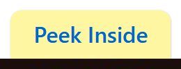
Covers + “Peek Inside” label
Product pages typically already contain an image of the book cover. Customers wishing to “peek inside” may be familiar with the cover itself being a link to a sample/preview. To increase awareness that the book has the “peek inside” feature, then the JavaScript library can automatically attach a “Peek Inside” label to the image.
Developer Guide
Download JS & CSS
- JavaScript: excerpts-1.1.0.js
- CSS: excerpts-1.1.0.css
Installation
Note: Different websites and platforms likely have their own preferred way of including CSS and JS assets. Your site's developer(s) will know how to include the assets appropriately.
The most basic install is to simply load the CSS and JS in the
head tag and point the hrefs to the location of the assets
as stored on your site's server.
Load the CSS file.
<link href="/path/to/excerpts.css" rel="stylesheet" />Load the JS file.
<script src="/path/to/excerpts.js"></script>Setup
Once the CSS and JS files have been loaded, the JS needs to be initialised. This is done by calling the init() method on the excerpts object. This should be done after the DOM has loaded.
<script>
excerpts.init();
</script>
Modals
Annotate relevant links with the data-jb-modal attribute.
<a data-jb-modal href="{url_to_excerpt}">Read Excerpt</a>
The JS will listen for clicks on any link element where the
data-jb-modal is present. A modal will appear containing
the excerpt within the Jellybooks Cloud Reader.
The {url_to_excerpt} is the URL of your custom excerpt
hosted by Jellybooks. URLs are obtained via the Partner Portal or API.
(E.g
https://www.jellybooks.com/cloud_reader/excerpts/ulysses_9780241243626-ex/L3Leb)
Selector
Some integrators would prefer to use a different attribute, or
potentially a class. To change the default selector from
data-jb-modal, use excerpts.init() to set the
selector option. E.g. if the link is annotated with a class called
"excerpt_link":
<a class="excerpt_link" href="{url_to_excerpt}">Read Excerpt</a>Then you can override the modal selector as follows:
<script>
excerpts.init({
  "modal": {
    "selector": "a.excerpt_link"
  }
});
</script>
The selector must conform to
Element.querySelectorAll() syntax.
Note: The {url_to_excerpt} is the URL of your custom
excerpt hosted by Jellybooks. URLs are obtained via the Partner Portal
or API. (E.g
https://www.jellybooks.com/cloud_reader/excerpts/ulysses_9780241243626-ex/L3Leb)
Mobile
Modals work well on larger screens, but become awkward for smaller form factors, especially mobile phones. Therefore, by default we follow the convention of not using the modal for smaller, mobile screens, and simply follow the link and allow the user to use the back gesture/button to return to the product page.
To disable this behavior, and show the modal on all devices change the
"show_on_mobile" option.
<script>
excerpts.init({
  "modal": {
    "show_on_mobile": true
  }
});
</script>
Modal Positioning
If you need the modal to be positioned over on the side of the
screen—useful if there are design elements on the page you want
kept in view—then you can use the
positioning configuration property to change where the
modal appears on the page.
<script>
excerpts.init({
  "modal": {
    "positioning": "right", // valid options are "left", "right", and "center"
  }
});

</script>
The positioning property can be set to left,
right, or center. If the property isn't set,
then the default option of center applies.
Calling excerpts.init will set a
jb-<position> class on the modal element itself,
where <position> corresponds to the positioning
option you set. The sample code above, which sets
positioning: "right" would result in the
jb-right class being set on the modal element, which also
has a jb-modal class.
This means that you can tweak the positioning of the modal by adding
your own styles for .jb-modal.jb-right,
.jb-modal.jb-left, and
.jb-modal.jb-center selectors in your CSS.
Peek Inside label
To apply the “peek inside” label, add the
data-jb-label attribute to the element containing the
cover. E.g.,
<img data-jb-label src="/path/to/cover.jpg" />Note: it’s still necessary to enclose the cover with the hyperlink to the excerpt. Otherwise the cover will show a peek inside label but nothing will happen when clicked/pressed, i.e.
<a data-jb-modal href="{url_to_excerpt}"><img data-jb-label src="/path/to/cover.jpg" /></a>Selector
To change the selector that identifies the image, use the
label.selector option. E.g., to look for images with the
peek_inside class:
excerpts.init({
  "label": {
    "selector": "img.peek_inside"
  }
});
The selector must conform to
Element.querySelectorAll() syntax.
Label text
You can customise the text of the label via the
data-jb-label-text attribute or the
label.text option.
<img data-jb-label data-jb-label-text="View preview" src="cover.jpg" />excerpts.init({
"label": {
"text": "View preview"
}
});Position
It’s possible to specify whether the label appears above or below the
image, and whether the label is aligned left, centre, or right. These
are configured via the the label.placement option.
Its value can either be a string:
excerpts.init({
  "label": {
    "placement": "top right"
  }
});
Or an object:
excerpts.init({
    "label": {
      "placement": {
          "x": "right",
          "y": "top"
      }
    }
  });
Alternatively you can set it via the
data-jb-label-placement attribute:
<img data-jb-label data-jb-label-placement="top right" src="cover.jpg" />Valid values:
x-axis (horizontal) |
left|center|right|left-outside|right-outside|left-edge|right-edge |
y-axis (vertical) |
top|bottom|vertical-center|top-outside|bottom-outside|top-edge|bottom-edge |
The -outside and -edge values for both the
horizontal and vertical position axes the button either outside the
image (for -outside), hugging its edge, or jutting halfway
out of the image (for -edge).
Note: the label data attributes will override the
label configuration in excerpts.init() in case
both are used.
Style
It’s possible to customise the styling of the label using CSS. The label is markup as follows:
<div class="jb-peek-label">
    <span class="jb-peek-label-text">Peek inside</span>
</div>
Additionally, excerpts.js comes with two built-in styles,
button and sticker.
A non-exhaustive selection of the various positioning and style options:
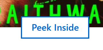 |
Button style on the edge of the border |
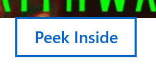 |
Button style outside the image |
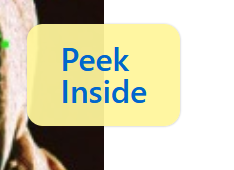 |
Sticker style vertically centered on the edge |
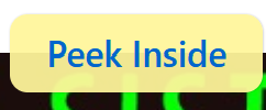 |
Sticker style horizontally centered on the top edge |
 |
Sticker style horizontally centered on the top outside the cover |
Demo
View our Demo page to see the modal integration in action.